
Orange is often the outlier in a palette—too bright, too burnt, or too bold. But for the architects and designers we consulted, the shade brings warmth and character without overwhelming a room. Here are 10 of their favorite shades spanning earthenware and salmon to tangerine.
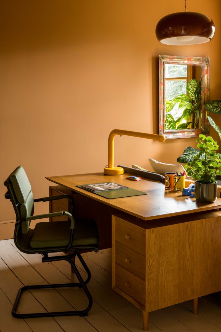 Above: Jessica Williamson of Bradley Van Der Straeten prefers the archived color from Paint & Paper Library called Rufus (455) for its “rusty deepness” as she describes. “It’s so rich it seems like it is always glowing, even in grey weather.” Here, the shade is applied to an office in their Tonal Terrace project in Dalson, London. Photograph by French and Tye, courtesy of Bradley Van Der Straeten.
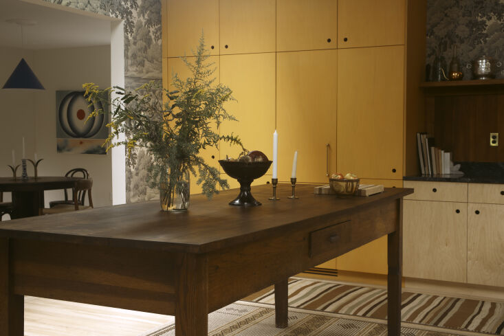 Above: In designer Raisa Sandstrom’s own kitchen set among her 1800s fixer-upper in Northampton, Massachusetta, she matched Farrow & Ball’s Dutch Orange in an Osmo oil-stained finish for the main kitchen storage cabinet. Photo from Kitchen of the Week: 8 Ideas to Steal from A Young Designer’s Romantic Kitchen.
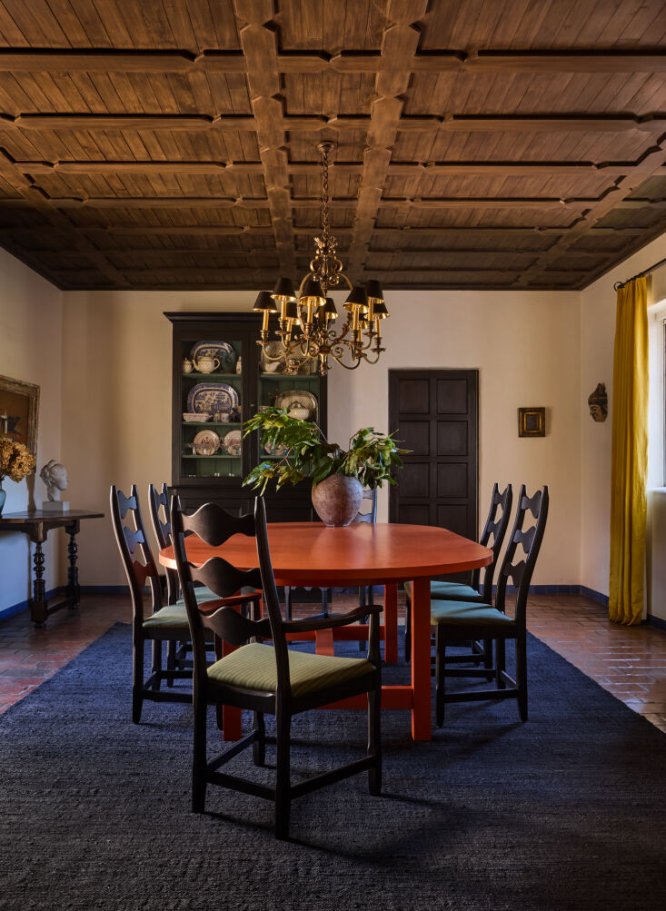 Above: From Todd Nickey and Amy Kehoe of Los Angeles firm Nickey Kehoe: “We love the opportunity to work with orange in both our projects and in our collection. Orange is versatile and plays well with others in the color wheel. From the faintest peach to this rich table in Farrow & Ball’s Charlotte’s Locks, we think orange can get overlooked. Charlotte’s Locks is vibrant with a rootedness that feels very earthy & tasteful.” The table shown is the Nickey Kehoe Community Harvest Dining Table.
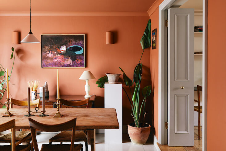 Above: London-based interior studio founded by Lucy Currell painted the dining room of her own East London home with True Terracotta, a color from Dulux. Photograph from “Nothing Flashy”: The Well-Traveled Home of UK Interior Designer Lucy Currell.
 Above: Charlotte Anderson and Anna Lea-Wilson of Fern Anderson Interiors utilized the deep peach quality of Farrow & Ball’s Faded Terracotta in an East London family home.
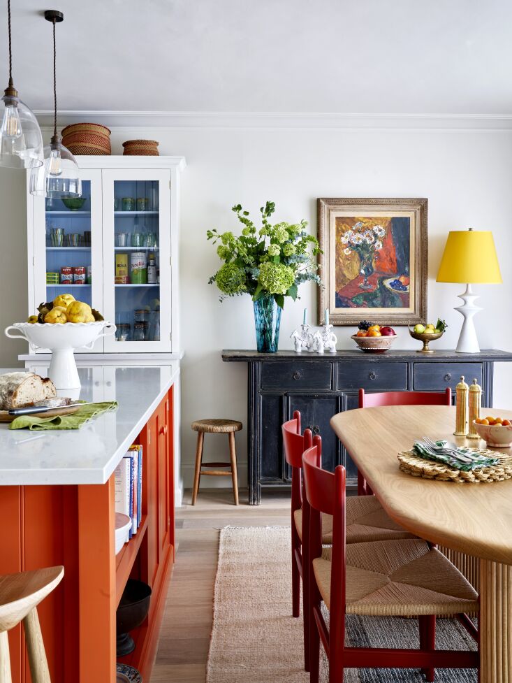 Above: Another vote for Charlotte’s Locks, this time from London designer Lonika Chande: “I love the depth and drama that this vibrant orange brings to this kitchen dining space with its neutral walls and countertop. Orange was our client’s favorite color and so this was a nod to that. This project has since encouraged me to use more orange in our work—it’s joyful and strong, and when used in small doses, is very effective.” Photograph by Milo Brown for Lonika Chande.
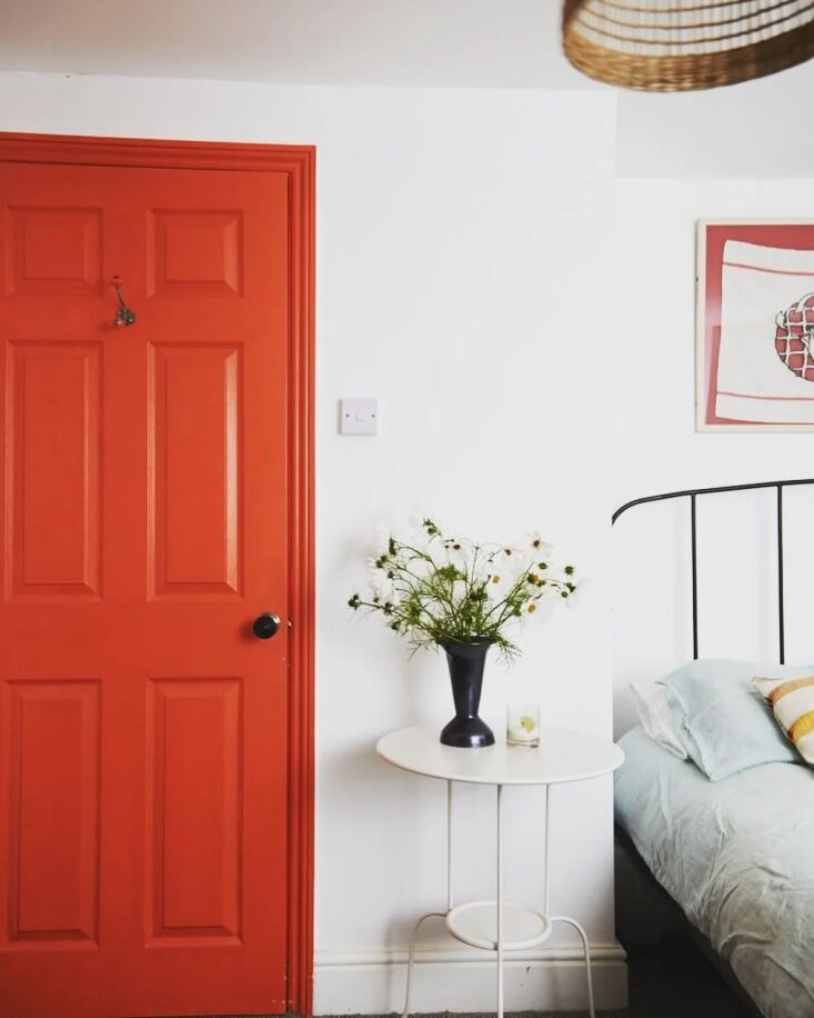 Above: And another Charlotte’s Locks—where designer Sophie Rowell of Côte de Folk painted a single bedroom door in the shade offering a bright spot of orange to an otherwise white room.
 Above: London designer Sarah Browne opts for Farrow & Ball’s Red Earth: “One of our favorite paint colors to use in smaller rooms like libraries and tv rooms where you want to create a warm and cosy atmosphere,” she posted about the shade on the brand’s Instagram account.
 Above: London-based interior designer Jill MacNair integrated broad swaths of Monkey Tail from Francesca’s Paints, a shade of orange that draws from salmon and light terracotta. Photo by Beth Evans from Italianate Modern in Full Color: Interior Design Jill MacNair’s Own Renovation in London.
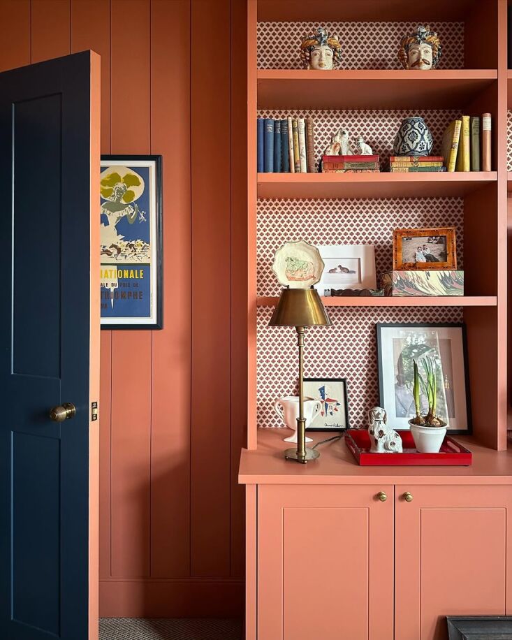
 Above: A good number of designers value Farrow and Ball’s approach to orange. The brand ambassador, Patrick O’Donnell, cites Red Earth for a warm, earthy tone that creates a cocooning environment. Photograph from Remodeling 101: 7 Color-Drenching Paint Tips from Farrow & Ball.
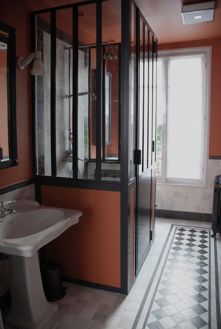 Above: Parisian designer Marianne Evennou reworked an apartment bathroom in a shade remniscent of Hermès. Two orange paint colors she likes are L’Encens and Le Charbon Ardent from Ressource for their softness—”integrated with black paint to calm down the strong electric feeling that you get from the orange,” she explains.
For more paint picks from architects and designers, see our posts:
- 10 Easy Pieces: Architects’ Barely-There Color Paint Picks
- 10 Easy Pieces: Architects’ Favorite Yellow Paint Picks
- 10 Easy Pieces: Architects’ Favorite Of-the-Moment Green Paint Picks
- 10 Easy Pieces: Architects’ Favorite Red Paint Picks